Remember bodice rippers? The romance novels we used to sneak from our mother’s room or the library, furtively shuffling away to our bedroom or a quiet part of the library to read like it was forbidden. The covers that were oh so tempting; Some flaxen beauty in a low-cut period gown that was half falling off her heaving bosom and slit up her thigh, half pressed against a man wearing half a shirt or no shirt- whatever showed off those rock-hard abs of his- and tight pants, with his long hair flowing in the wind, holding the heroine like he was keeping her from falling into a swoon?
Back then, we gasped at the sex scenes when they used words like “throbbing manhood” and “heaving bosom”. The covers told a story, somebody was getting plundered and someone was going to be doing the plundering.
By today’s standards, those romance novels are well…tame. If not a little sketch and borderline dubious consent.
There’s been a turn how romance covers are showcased. Those giggling children who hid in their bedroom reading their mother’s romance novels are now head editors for major publishing companies and have decided that the next generation shouldn’t have to go through the embarrassment of reading a book that shows half-naked people on the covers.
While Kindle and other e-readers have taken the shame out of reading romances by hiding what is actually being read, physical books needed to figure out how to compete. On an e-reader, nobody knew what you were reading, with a physical book, anyone could see what you were reading and “judge” accordingly.
Somewhere the decision was made to “tame” romance covers and it worked. But now, have we gone too far to the other side?
Last week on Twitter (or X, if we’re being timely), a discussion was had by two readers over the cover reveal of a new sci-fi fantasy book coming out through Fae Crate, a subscription service. According to the women, the story was a sci-fi story about an alien prince and a human woman and an intergalactic battle. The covers in question are re-issues of a popular and beloved book. One woman cried because this was one of her favorite books and she was so excited and had preordered them sight unseen. When the cover reveal happened, it portrayed an animated rom-com-looking cover in bright colors that gave no hints of the book being sci-fi, alien, or even any sort of intergalactic anything. The woman was so upset she wanted to ask for a refund because they had just ruined a favorite story of hers.
So, have we gone too far to the other side? Have we “kiddified” our romance covers?
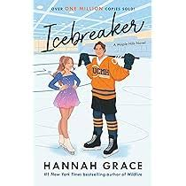
A good example of this is Hanna Grace’s Icebreaker. The story is a college romance between a competitive ice skater and the captain of the hockey team who are forced to share the rink. They don’t like each other and, of course, it just gets steamier from there. When I looked into the warnings, it is specifically not marketed to anyone under the age of 18. But the cover looked like it could be for young teens. I was at Books a Million and they have the bestseller wall. Icebreaker was on it. Two 11-year-old kids, one boy and one girl were over by the wall where the boy was giggling and showing them something inside the book. Because it looks like a tween book. And they found something in it that reminded me of when the boys used to look at National Geographics and giggled at the pictures of the tribal women.
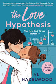
This isn’t the only one. Heck, one of my favorite books, The Love Hypothesis, which is not for teens because of the graphic sex scenes, has a teen-friendly book cover.
Have romance novels gone too far to the other side? In trying to sanitize the covers to prevent embarrassment, have they created another problem?
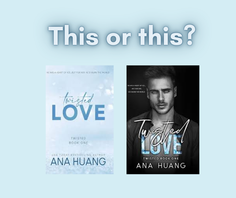
A perfect example of this option is Twisted Love by Ana Huang. I found two covers for it. This is listed as contemporary romance, New adult literature, and erotic literature. The first cover is a still photo of a man. From the image, the reader is going to know that this is going to be steamy. The other book cover has a blue sky background with the title in blue a la a Colleen Hoover type of cover. It looks safe. Anyone seeing someone reading it with the second cover isn’t going to know what they’re reading at first glance.
Let me be clear, there’s nothing wrong with cartoon/illustrated book covers. But create options. Let the 13-year-old readers know that this isn’t for them. Other than a cost standard, why aren’t these options? Even if it’s cost, why aren’t there variations like there are with comic book covers? We order them from the publisher or Amazon with our choice of cover. But in the bookstore, there should be more adult-looking covers on them. We don’t have to go back to the half-naked couple on the covers, but we shouldn’t be kiddifying our spicy content either. There has to be a compromise.
We romance readers argue that there is no shame in reading romances. Walk the walk. If there’s no shame reading romances, then we should have covers that reflect the story within, not something that looks like we might be reading something we bought in the teen section.

Speaking of spice, welcome to Spring friends! Watch out for bunnies of every type, this is the time when they’re multiplying. Enjoy the warmer weather coming. Open windows. Take a walk outside. Relax and curl up with a good book.
